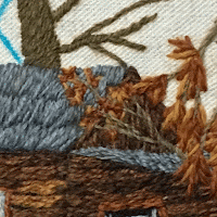
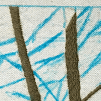
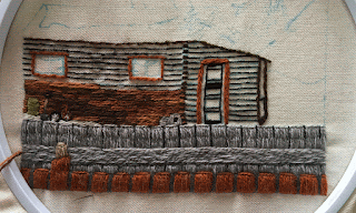
I have finished all the tree stems and all the large branches that need to be completed before the rest of background. I’ve gotten to the point where some problems are starting to show up. The building, the tree tops and the fence post all look a little crooked. The door and the hill stick out too much. I can see a few little fixes I could easily make. I'm not sure which one is affecting the piece the most.
I went back and looked at the scan of the drawing I made the pattern from. I circled all the areas of the picture that stuck out and made a few notes on how I could improve the look. I went through and made the changes shown below. Overall it did make the design look a lot better.

 The most obvious thing that did not fit in well was the door. I removed the stitching from the door so that it could be completely redone. I filled the door back in using the same colors as the fence post and the shovel handle. The door still sticks out a little more than I wanted it to but looks better than before.
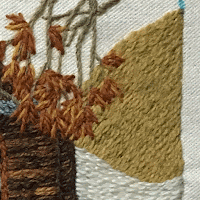
The yellow ochre hill is way to bright. First I tried to tone it down with white thinking it would look like patches of snow. That made the
hill look even brighter. Using the same green as the trash can I made straight stitches on the hill. These look like trees growing on the hill. This toned it down a bit and added some texture instead of being a large block of color.
The light brown fence post looks a little crooked. The light colors on top of the post don't blend in. I took these light lines out. Widened the
post at the top and finished it off so the stitching at the top was straight.
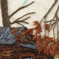
The fix that changed the piece the most was straightening
the edge of the lower roof. Even though it was just a few stitches and was the fastest of the changes to make. It is near the focal point and the vanishing point of the picture. This little fix changed the perspective of the whole building.

 The right tree was not straight at the top. It was slanted at the top making it look like it stopped just before the top edge. It
would be even harder to keep the top straight with a crooked tree top.
I have the piece almost finished now and will write one more post showing the final piece.


